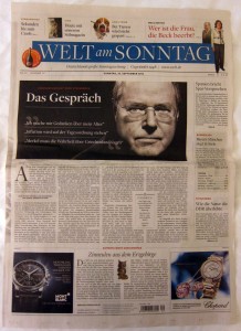
With editorial budgets being squeezed ever tighter and managements increasingly focused on digital first, does it still matter what a newspaper looks like? You bet it does. I spend half my working life in newspaper offices and, unfortunately, still find:
If longevity is the aim, these nasty habits need to be changed. Quickly. Good design can keep the sale stable but, more importantly, poor design is guaranteed to cause premature haemorrhaging.
Some regional newspapers are excellent of course. I was massively impressed with the front pages and the design shortlists at last week’s Regional Press Awards. But there are still too many that look boring - and in today’s newspaper world, boring is the biggest sin.
If you recognise any of these traits, you may want to take a look at my tips on how to make your paper look better, which is in this month’s InPublishing magazine. Take a look here.
• Flights of dull fillers, plundered from the ‘what’s on’ column?
• Headlines with blands words such as ‘boosts’, ‘plans’ and ‘residents’.
• Pictures of buildings as the main image.
• Citizen journalism that has led to pages of landscape pictures. I like contributed stories and photographs - but am often not keen on the execution. Newspapers are about people, not sunsets and trees. If the readers want flowers, they can pick up a bulb catalogue.
• Templating that has been misunderstood and has led to two-deck headline syndrome. It has made some journalists lazy and stifled their creative juices.
• Body copy set in 8pt Times, which is just about unreadable.
Some regional newspapers are excellent of course. I was massively impressed with the front pages and the design shortlists at last week’s Regional Press Awards. But there are still too many that look boring - and in today’s newspaper world, boring is the biggest sin.
If you recognise any of these traits, you may want to take a look at my tips on how to make your paper look better, which is in this month’s InPublishing magazine. Take a look here.