Let's start with The Daily Telegraph. This is when a broadsheet comes into its own. The eyes just sit above the fold and the whole page is like a portrait. Brilliant. The bar code (one of the broadsheet consequences) and the Autumn Statement blurb are unobtrusive enough.
The Independent lets Mandela's face dominate almost the entire front and uses an understated quote at the bottom right. No headline required.
In Metro's case, no words at all are needed. As editor Kenny Campbell tweeted 'What words are there?' The man is the story and there he is ... in full dignity. A stunning and sad image.
The Times also decides few words are needed as it goes for one of its trademark wraps. On the back it runs one of the most memorable quotes from The Long Walk To Freedom: “No one is born hating another person because of the colour of his skin, or his background, or his religion. People must learn to hate, and if they can learn to hate, they can be taught to love, for love comes more naturally to the human heart than its opposite.”
The Guardian uses the Berliner size to great effect. It clears the front, skies the image, reduces the headline, takes it under the fold and uses a quote from Jacob Zuma. Simple - and powerful.
Hats off to the Western Morning News. A fantastic smile and a positive image, along with a strong headline.
The same image graces the Western Mail along with another strong headline. The paper also blurbs a 16-page pullout inside.
The Northern Echo, perhaps appropriately, had its own Local Heroes awards last night and then had major press problems caused by the bad weather. It still managed to produced this great cover. The only paper I've seen so far to use the Flag of the Republic.
The Irish Independent uses an effective crop, bleeding off the page.
That smile features again on the Daily Mail - and if you are going to call him anything, colossus is just about right.
It's a story of such magnitude that even the i clears its front.
The Scotsman does a good rush job for its early edition. It doesn't wipe out its front but a strong image certainly dominates. A light goes out it says, and few could argue with that. Later it clears the front for a dominant image, although it might have kept its first edition headline.
In the early editions the main redtops opt not to do a tribute and go for the same stark headline. It's not often they get a breaking story these days, so just decide to tell it as it is. The Sun updates later for a more fitting President of the World.
Meanwhile, over at The Times, Peter Brookes is in top form
Here are some more of Ireland's front pages.
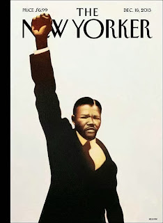
And finally, a sneak preview of next the edition of The New Yorker.
So, hardly surprisingly, all the newspapers are as one. Fitting tributes to the greatest statesman of our times. A memorable and special night.
To see all of the pages and those I have missed out visit the excellent #tomorrowspaperstoday and @suttonnick


Its a great pleasure reading your post.Its full of information I am looking for and I love to post a comment that "The content of your post is awesome" Great work.
ReplyDelete