Showing posts with label The Times. Show all posts

Friday, 25 April 2014

Newspaper things that caught the eye ...

Among the many things in newspapers that caught my eye this week were:


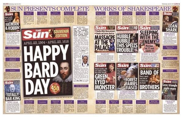
The Sun celebrating Shakespeare's 450th birthday. Tabloid innovation at its very best.


The Times's bold front page crop on its Bernie Ecclestone picture. Cropping the heads off? Yes, it breaks all the rules but doesn't it grab attention? 


Then there was the Financial Review in Australia where the production team hit the wrong button which led to this paper hitting the streets. The front page includes heady, heady type headlines including one which reads 'World is fukt'. Ouch. Here's The Guardian's story on it. 

For sheer CFM factor here's the New York Daily News with a story about a Klu Klux Klan leader being arrested for paying for sex with a black man dressed as a woman in a car. Wow. 

Saturday, 16 February 2013

Design awards: Honorable mention for Times

It's that time of year when dozens of judges from the Society of Newspaper Design pore over the world's newspapers and decide which are the best looking. The five winners, who can now claim to be the world's best designed newspapers, were announced on Wednesday. They are:

Dagens Nyheter, Stockholm, Sweden


Welt am Sonntag, Berlin, Germany 

Die Zeit, Hamburg, Germany

Politiken, Copenhagen, Denmark

The Grid, Toronto, Canada


As usual British newspapers were under-represented. I was pleased to see, though, that The Times received a well-deserved Judges' Special Recognition Award for its 'visual story telling' of the Olympics.


The judges said: "It’s that level of detail that really separates this from other entries. It’s clean, well thought-out, and so smart. It uses the medium incredibly well, and in such unique ways. It was the most thorough and consistent coverage we saw of the Games. A true Olympic effort — and all done on deadline." Well done to design editor @jonhilldesign and his team.


The Times also won a Gold Medal for Magazine Design for Eureka. The judges said it was 'both beautiful and explanatory'. It is also, sadly, no more. The 64-page science magazine closed last October after 37 issues.


Another paper that caught my eye was the Gulf News with its confident and detailed infographics. If you want to see more, you can plough through the many categories on the SND website.

Wednesday, 15 August 2012

How The Times captured Olympic history

If you enjoyed The Times' Olympic wraps, then watch this excellent video on the thinking behind them and how the pictures were chosen.

Friday, 27 July 2012

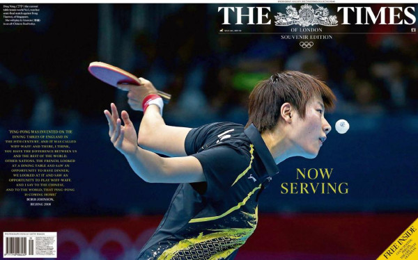
The Times gets off to cracking Olympic start


So, Britain is on the eve of its biggest sporting occasion ever. Not even the World Cup in 1966 or the Olympics in 1948 can match this one. For newspapers that means the chance to go for it ... to create a memorable, historic front page. It's not as easy as it sounds though. The front pages that create themselves are those that record something that has happened. You have photographs, quotes, victims, perpetrators and a record of events. The hardest are those that preview an event and try to report on something that hasn't happened yet. That's when creativity, planning, headline writers, photographers, writers and layout artists all have to come together to build something special. So how do today's papers fare?
For me, The Times wins it by an Olympic mile. A stunning photograph of only two colours used as a classy wrapround. If you'd told me ten years ago the Times would lead on a magenta splash headline, I wouldn't have believed it. But it works. The back page quote by the founder of the modern Olympics, Pierre de Coubertin, is a nice counter to all the corporate nonsense that has surrounded the Games so far. The picture is by the Press Association's Dominic Lipinski @domlipinski. Really deserved a byline.


The Daily Star and Daily Telegraph aren't natural bedfellows but both use the same photograph and, more or less, the same headline. Great photo, although I'm not sure that too much effort has gone into the Let's party/Get the party started approach. 
Despite the universal outburst of positivity, the brilliant Matt still manages to add his waspish view.
The Mirror uses the same picture as the Telegraph and Star and adds a trademark pun to the splash headline. It also tries hard to wipe the slate clean ... by reminding us of all the awful things that have gone before.


The Daily Mail also has a lively picture across the full width. This time it's 81-year-old Torch bearer Florence Rowe dancing outside 10 Downing Street, with Dave and Sam Cameron in the background. It certainly reflects the joy of the Olympics. The headline is on the predictable side - although stronger than Let's Party. But is the ! really necessary?

Instead of gravitas, The Guardian goes for circus. It's main picture is not really an iconic image ... Ab Fab stars Joanna Lumley and Jennifer Saunders partying with the Olympic Torch in London. In contrast the headline has a certain poignancy. One way to deal with something that hasn't happened yet is to get the best writers on the job ... and typically The Guardian does that brilliantly with a think piece from author and columnist Jonathan Freedland.


The Independent wipes out the front page with a classic London symbol - a double decker red bus in Oxford Street.


The Sun has also comes up with iconic British symbols ... all expected to appear in tonight's opening ceremony. Perhaps inspired by Linford Christie's famous claim that he started races on the B of the Bang, they all begin with B. They are an interesting choice ... Bond, Becks, Beatles, The Baked Bean (why the definite article?). What else could they have thrown into the mix ... Beef, Beer, Buses, Big Brother, Breakfasts, Bovril, Brass Rubbing, Blackpool Tower, Buckingham Palace, The Beano, Bingo, Bubble and Squeak, Binge drinking, Bad Weather?  The list is endless. Could have filled the whole paper. 

The Express manages to get the royal family, including the ubiquitous Kate, into its Olympic picture but decides that pensioners being ripped off by the taxman is far more important.
 The FT chooses an arty shot but also decides there are weightier issues to lead on. With the Nomura axe falling on top staff, who could argue?
All very positive though ... fingers crossed for more spectacular and good news pages in the weeks ahead.
Thanks to @hendopolis #tomorrowspaperstoday


  

Saturday, 12 May 2012

The Times they are a changed ...

Here's a curate's egg of a page from today's Times. The picture of Rebekah is stunning, sharp, nicely cropped and positioned. She was yesterday's main player and there she is, in full flow, staring out of the page. It will undoubtedly be the first thing the reader sees. The headline above her is spectacular. I have never seen a front page headline (or in fact any headline) with five abbreviations before. Talk about cryptic. You need to know the story to understand it but that's OK. Making AB readers work a little for their headlines isn't really a problem. But it isn't Mrs Brooks and the crossword puzzle clue of a headline that will drive sales today. The paper is working hard to ensure its blurbs will encourage the casual readers to slip a copy into their shopping trolleys. They work too, at least to a point. The Engelbert pictures are intriguing - who could resist the Eurovision oldie as Liam Gallagher or Sid Vicious? But why two headlines? Engelbert as you've never seen him before is enough.The second blurb is just what readers need in these straitened times - money off vouchers for a day out with the kids. But the headline, Inside today, is one of my biggest bugbears. 
Inside: Where else would it be? In our rival's publication? Behind the bacon counter?
Today: When else would it be appearing? Yesterday? Next Thursday? 
The same applies to Free inside on the gardening blurb. The words Inside, Today, Also, Plus and Free are regularly used in blurbs  - and are just a waste of ink and newsprint. The Times blurbs are good on content but too cluttered. Why bury the message?
The celebrity blurbs down the right are effective teasers (notice that they don't need to explain to the readers that these particular stories are inside). I would buy the paper for any of these, especially Caitlin Moran who is essential reading. Finally we come to the splash. Once upon a time newspapers used to sell themselves on their lead story. Now, tucked away at the bottom of the page, this is by far the least interesting element of the page (except for the bar code of course). So there's the Times as it is today -  seven pictures, six teasers, five abbreviations, four-column lead, three-word splash headline, two news-items and one bar code. 
Then there is the back page ... a stunning sky blue piece of artwork, which takes in the titlepiece, and sets the mood for tomorrow's Premier League finale. Bold, and innovative. The story underneath is presumably to add a bit of balance ... but I might have been tempted to wipe out the whole of the back. It's certainly all a far cry from The Thunderer of yesteryear ... and hard to believe that it's only eight years ago that the crusty old broadsheet turned compact.
Thanks as ever to @suttonnick

Friday, 29 April 2011

The Times gets the wedding bouquet


Here we go. The Times wins it hands down, a great decision and fabulous wraparound. It was the surprise and most natural image of the wedding. The kiss is a great picture too. It may be a bit safer, predictable and we've seen it before but, hey, it's an iconic image and this is all about thinking souvenir. The Northern Echo, Daily Mail, FT, The Sun, the Evening Gazette in Teesside, the Daily Express and the Daily Telegraph took that option. The Star's crop is on the tight side with the headline obliterating the dress. I like the Mirror's decision to leave in the bridesmaid too. I know she detracts a little from the main image but she does raise a smile. The Guardian left in two bridesmaids ... they balance the picture but the girl on the right adds nothing. And the FT cropped the wrong bridesmaid off. The Echo had a dilemma between the kiss and the car and went front and back. Good solution. As for the Independent, what can I say? Different, brave, original, not pandering to the mass hysteria, intelligent ... but really, what were they thinking? Pleased they scrawled The Kiss on it though, otherwise we might have struggled to know what we were looking at.


Tuesday, 11 May 2010

Every picture tells the strain


Tough decision for the picture editors today, with some quite brilliant portraits of Gordon Brown. The back of his head and the hunched shoulders work well in The Guardian and The Sun, although the door number gets lost a bit on the Sun's version. Simple and effective in The Guardian. The Independent and the FT use similar pictures but the Indie, even with the missing chin, really shows the strain. Why the background in the FT? Then there is the Mirror - strain and defiance. Excellent photographs that sum up the moment. The Express, on the other hand, chooses to splutter on with a shabby, sordid stitch-up-type headline. The Daily Star quite remarkably opts for three dull headshots of politicians in suits (when was the last time that happened?). Its headline though sums up the whole affair perfectly. Memorable front pages. Thanks to The Guardian for drawing them all together.


Saturday, 27 March 2010

Can this byline in The Times be real?

Thanks to Cornwall and Devon editor Andy Cooper for alerting me to this byline. Andy says: "You would have thought The Times’ newsdesk might have thought twice about assigning this particular reporter to this story." Good point. Could be an incredible coincidence ... or it could be a rogue sub at large?