
Thursday, 8 July 2010
Just don't do it ....


Wednesday, 7 July 2010
Back to basics ...
Here are some basic training tips that, on the evidence of these recent examples, we clearly need to revisit.
 1. Don't cut and paste from brochures. Good sub-editors should know how to read ... and to edit.


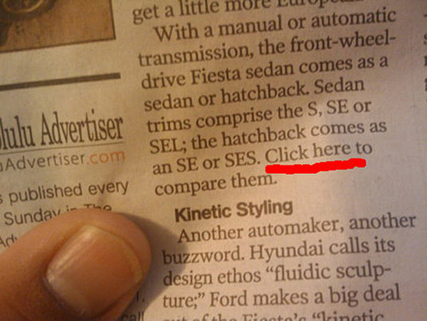

2. Have good taste and a dirty mind ... so that you keep the innuendo and double meanings out of the publication.

This rule also applies to the advertising department.


 3. Libel by juxtaposition is very rare, I'm pleased to say. It usually just leads to giving people a laugh at your paper's expense.
4. Always, always, always check your sources, something that AOL appeared to have forgotten here. The web is not a reliable source of facts ... go to original sites.
 5. Watch out for that old favourite of disaffected sub-editors ... the abuse of drop caps.
More to follow ...


And it certainly applies to the relationship between pictures and words.

4. Always, always, always check your sources, something that AOL appeared to have forgotten here. The web is not a reliable source of facts ... go to original sites.

More to follow ...
Saturday, 3 July 2010
Africa wins the typeface World Cup

Now the favourites to win must now be Brazilian designer Yomar Augusto whose Unity font is to be found on the adidas shirts of Argentina, Germany and Spain. Certainly a worthy winner - but not quite as stylish as Olembe.

Friday, 25 June 2010
In praise of Irish newspapers
Been in Belfast all week working for one of my favourite papers, the excellent Irish News. Newspapers (along with the nightlife) are still vibrant on both sides of the border in Ireland. The Irish News is one of the few daily newspapers on these islands that sells more copies now than it did 15 year ago. It was also the first daily paper in the UK, despite the Guardian's claims, to adopt the Berliner format. It is now a compact that covers the big stories, such as the Saville Report and the church in crisis, in the most authoritative way. The paper was also in the vanguard of putting its content behind a paywall - perhaps one of the reasons why its sale has remained buoyant. If you want The Irish News's take on anything, and thousands of people in Northern Ireland do, you have to buy the paper. While in Belfast I also came across a slick marketing supplement by the Belfast Telegraph, now under the editorship of Mike Gilson, showing the range of first class front pages and campaigns that the paper has delivered. It oozes with confidence and self belief - something in short supply in too many newspapers these days. Over the border the Irish Examiner offers better Premier League coverage than most, if not all, UK papers. And the Evening Herald in Dublin has proved that outsourcing your entire production ... in its case to the South of France ... does not mean that the standard of subbing or headline writing is in anyway diminished. As this example clearly shows ...
 PS: The sun was also shining in Belfast all week and my Irish friends were enjoying the World Cup enormously ... not least the performances of France and England.

Saturday, 19 June 2010
Another contender for non-story of the year

Tuesday, 15 June 2010
Creative World Cup by The Guardian

Newspapers still big in Japan

Monday, 14 June 2010
Post script on Saturday's debacle
Gloomy night on Saturday. Whatever the positive spinners might say, England didn't look good. Even forgetting the Green blunder, the defence was all over the place failing to win the ball on just about every corner and free kick. And Carragher and Terry looked far too slow. Dawson should start on Friday. And to add it all we had friends round to watch it on HD, so missed Gerrard's goal. Argentina, by contrast, look sensational and the Germans don't look too bad either. I fear we won't get past either of them. Anyway, to cheer you up here are a couple of post-match newspaper funnies.
First watch this recreation of the game in lego by The Guardian - far more entertaining than the original.

First watch this recreation of the game in lego by The Guardian - far more entertaining than the original.

And then there's this headline from the New York Post that just about puts everything into context.
Subscribe to:
Posts (Atom)

