
Showing posts with label TYPOGRAPHY. Show all posts
Showing posts with label TYPOGRAPHY. Show all posts
Tuesday, 23 September 2014
Inside typographer Alan Kitching's studio


Thursday, 5 June 2014
Times New Roman: The movie

Times New Roman wouldn't be my first choice of typeface for a newspaper design. There are many more readable serifs for body copy as my chart below shows (you can read about the chart's origins here). That said, I appreciate the elegance of Times and Times New Roman and their historical importance. These are nicely reflected in this short film dedicated to the font by The Times and Sunday Times. It's a must-watch for anyone interested in typography. The film is part of the Forever Unquiet series of shorts on journalistic issues which include photojournalism, the power of words and why journalists should question everything. When you get a minute take a look at them all. You won't be disappointed.

Footnote: The settings for this blog mean this is a lo-res jpg of the type chart. If you would like a hi-res PDF drop me an email on petersandssms@gmail.com and I will send you a copy. There is also a chart comparing the characteristics of sans headline faces used by newspapers
Wednesday, 5 March 2014
Type is my life: Fonts legend Mike Parker dies

Mike Parker, the man who gave the world Helvetica, died on Sunday. He was 84. He was also responsible for around 1,000 other fonts. He also featured in the movie Helvetica which, if you haven't seen it already, is a must-watch. Parker's amazing typographical journey started with the Mergenthaler Linotype Company in 1959 and ended with the Font Bureau. There are many tributes to him around this week including this one on Time's website and this fascinating interview, which opens with 'My name is Mike Parker and type is my life'. Please watch it.
Friday, 10 May 2013
Four funny fonts films

If you are interested in typography (which you should be) and even if you think you're not, you need to watch the History of Type - an Animated Short by Ben Barrett-Forrest. It covers everything from Gutenberg's original Blackletter typeface to creating your own fonts on a computer - all in 5 minutes 10 seconds. Brilliantly done - and funny too.

It joins my list of all time favourite typography shorts. These include the excellent tribute to Neutra Face by Lady Gaga. "You can read my Neutra Face, (even when it's bold italics)" to the tune of Poker Face. Stirring stuff.

Then there is the fonts conference with typefaces given human personalities. Baskerville is 'a shrivelled bastard,' Futura a space girl and Century Gothic a modern goth with attitude. Only problem is that it's Comic Sans who saves the day. What are they trying to tell us?
This video led to my family recognising people they knew by their typographical traits. I like to think I'm a cross between Utopia Bold and Avant Garde. My kids think I'm more Goudy Heavyface and my wife definitely likes to think of me as Minion. Which one are you?
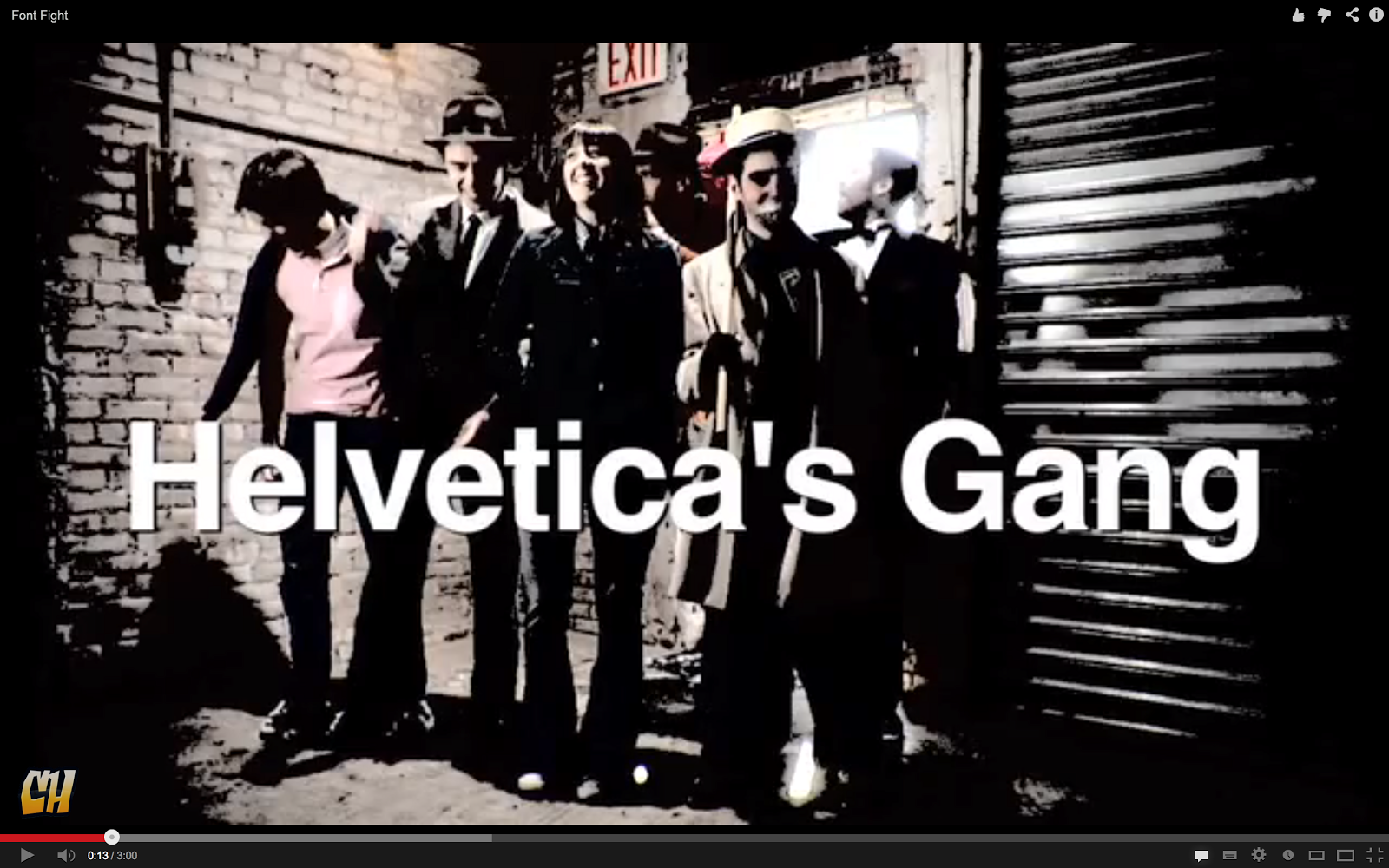
From the same stable, CollegeHumor, is the fight to the death between Helvetica's gang and Arial's gang. Watch it here. "Arial. I haven't seen you since you cloned me and stole my identity. I've been waiting for this day for 26 years." This time, though, Comic Sans reverts to type.
It all serves as a reminder that typography isn't just for geeks ... it's fascinating and it's funny. Really.
Saturday, 13 October 2012
Can you tell your Goudy from your Gouda?

Monday, 17 September 2012
The Cooper Black comeback

When I was a young chief sub on the Evening Despatch in Darlington, 30 years or so ago, I was nominated for a design award and off I went to a swanky hotel in the Smoke. When I didn't win I collared the judges in the bar and asked why the winner's portfolio was better than mine. "Ahh," one of them said. "We liked your pages, confident use of pictures, good white space, big impact ... but you could have used more modern typography." "Like what?" I asked. "Look at all the winners they said ... they all used Cooper Black."
We didn't have Cooper Black in our caseroom. Just Century Bold, Times, Bodoni, Garamond, Clarendon and a selection of sans faces including Tempo (the font The Sun still uses today) and Univers. So I could only look on as the newspaper world fell in love with Cooper Black.
We didn't have Cooper Black in our caseroom. Just Century Bold, Times, Bodoni, Garamond, Clarendon and a selection of sans faces including Tempo (the font The Sun still uses today) and Univers. So I could only look on as the newspaper world fell in love with Cooper Black.
 |
| The Sunderland Echo - Cooper Black titlepiece |
Everyone from the Liverpool Echo to The Sun decorated their pages with it. The Sunderland Echo even used it for its titlepiece.

It wasn't just newspapers either. I thought it looked pretty cool on the album cover of the 1971 Doors' album LA Woman but when it was hijacked by TV programmes - Dad's Army, Cheers and Mash included - often in yellow caps, it lost its coolness altogether.

It was an Old Style serif which seemed to have been drawn by a child. Its O sat at a peculiar angle, the cap A was definitely distorted and the lower case f looked like a deformed chess piece.

You couldn't use it as a text face (it fills in under around 14pt) and it didn't have a great headline count either. But the newspaper world loved it ... briefly. For some reason, when the computers came along, it disappeared from newspapers almost as quickly as it appeared. It was occasionally used on ironic features about 70s and 80s fashion, but that was it.
Now though, the font is enjoying a bit of a revival ... and I don't just mean easyjet and Garfield making it synonymous with orange.
Now though, the font is enjoying a bit of a revival ... and I don't just mean easyjet and Garfield making it synonymous with orange.


Modern bands, such as Marina and the Diamonds and The Black Keys, have adopted the font. And tee-shirts declaring a love for Cooper Black are for sale online (although I have never seen anyone wearing one in real life).

So I was fascinated to receive the brilliant Visual History of Cooper Black (at the top of the page) which Fibers sent me this week. Very smart, stylish and informative. I have long grown out of my blind dislike for Cooper Black. It reminds me of my youth, can have impact on posters and is bold and effective on artwork and tee-shirts. But I still draw the line at using it in newspapers. It was never, ever, really a newsprint font ... despite what those misguided 1980s' design judges believed.
Thanks to @fibers for the nice graphic.
Thanks to @fibers for the nice graphic.
Friday, 4 May 2012
Suit happens ...

Saturday, 28 January 2012
If typography was a sport ...

Sunday, 15 May 2011
Can you read the bottom line?

Thanks to Andy Cooper, editor in deepest Devon and Cornwall, for this addition to our bill collection. Clever. A slab serif too, close to the original Snellen chart.
If fonts were dogs ...

Tuesday, 18 January 2011
Type comparison 2 - sans headline faces


One of our Irish clients has been in touch, looking to change their sports page headline font from Franklin Gothic. The key question in any such change, of course, is why? Do they want:
- A more economical face (a better count)
- Clearer legibility
- Stronger display
- Something more modern
- A different font from another title or from other sections
- A brand change?
Anyway, in order to help them consider which font they might go for, we have prepared another typechart. This one is for sans display faces for newspapers. There are of course different weights for all those listed, except Impact. If you would like a higher res PDF than the jpgs above, let me know on petersands@mistral.co.uk and I will send you a copy. The previous typechart for newspaper body copy fonts can be found here.
Saturday, 1 January 2011
Good use of space?

Friday, 3 December 2010
Body copy comparison - Times v Nimrod

Wednesday, 1 December 2010
Lady Gaga meets typography
Clever video extols the virtues of Neutra Face. More classic typography funnies can be found here, here, here and here.
Thursday, 18 November 2010
The eighth wonder of the world

Tuesday, 5 October 2010
The case against upper case
 |


The advance of lower case - road signs, health warnings and even tabloid headlines now embrace the more legible style
Middle market newspapers, I am pleased to say, are almost wholly lower case in their display typography these days. The Mail still goes for caps for impact on Page 1, but is just about exclusively lower case inside.
Even the red tops have moved towards more lower case headlines. Why? Partly because capitals are harder to read. Anyone who went on a Bob James course, and there were hundreds, will have it drummed into us that lower case letter structures and word shapes are more distinctive - the ascenders, descenders and other projecting parts increasing clarity. Caps also eat up more white space, which is essential to legibility. Equally important is the fact that caps are less economical and therefore we get fewer meaningful words. The legacy of local newspapers trying to copy the black sans caps of The Sun and the Mirror, has been thousands of meaningless headlines in which none of the key words fit. I recently came across a local newspaper that carried this headline in 230pt Helvetica Neue caps on Page 1:
SUPERMARKET
CAR PARK ROW
It was a story about a shopper who had damaged a tyre in a supermarket car park and was cross because the store would pay up the £66.30 to replace it. Barely worth one deck of 14pt, let alone hitting the poor reader across the head with a dull mallet.
Marsh mentions the lower case font now used on British road signs. When you are darting between the lorries on the A1 in the rain and dark. legibility is critical. A wide open sans, lower case, with plenty of background space is just what is needed. He might have also mentioned the warning notices on cigarette packets - all lower case by edict of European parliament.
Caps are still needed of course, as Marsh's column illustrates vividly. 'I had to help my uncle Jack off a horse' really does need a capital J.
Tuesday, 24 August 2010
Don't go back to the bad times

Saturday, 3 July 2010
Africa wins the typeface World Cup

Now the favourites to win must now be Brazilian designer Yomar Augusto whose Unity font is to be found on the adidas shirts of Argentina, Germany and Spain. Certainly a worthy winner - but not quite as stylish as Olembe.

Thursday, 10 June 2010
The sans and the fury


Tuesday, 8 June 2010
Put your best font forward

Subscribe to:
Posts (Atom)
