
This is as straight as they come from The Standard Times. A square, badly-cropped picture with more suit than expression and a headline that feels the need to remind readers what Obama's first name is. And why the index on Page 1? It's probably been thrown together as the result emerged but some forward planning would have led to a bolder page.

The Washington Post's free paper, Express, goes for another square picture and the world's biggest one-word headline. There's no doubting the impact ... although the picture could have been cropped tighter. His head is just too small, perched on his huge name.

The Panama City News Herald's choice of picture doesn't really capture the moment. Obama looks like a fairly ordinary face in a blurry crowd - and is barely the main focus. There are an awful lot of words to explain how nothing has really changed.

This is a very powerful page top - one that looks like it has been properly designed. The picture is atmospheric and captures some of the emotion. The votes on either side of The Reporter's titlepiece work well. Again a one-word name headline is seen to suffice.

Here's a similar crop of the same picture in Town Talk from Louisiana. The same one-word headline, only this time above the photograph. I prefer the serif lower case, which doesn't overpower the image. Pity about the advert.
 The Examiner in San Francisco captures the mood in both its choice of picture and its headline. This was not the elation of four years ago, it was more relief. The sombre picture and understated headline tell the story well while retaining impact. Nice job.

The Canadian paper The Province, based in Vancouver, does it better though. It clears the front page of the clutter which allows it to use the same statesman-like photo much bigger. The headline would have been my choice too ... it's what Obama said. Very stylish.

If you are going to use a library headshot as the main picture, then the key is crop it well. The crop in Newsday is nice and tight (no suit) and the smile sits perfectly in the centre of the frame. A strong headline too. The second story might look like an advert but is an effective way of recognising that in Long Island, election or no election, there is still a weather crisis.

The Virginian Pilot's crop is nice and tight too, neatly bleeding the face off the edge with a slight cutout around the masthead. The organised clutter at the bottom of the page works and, if you are going for a one-word, 'encore' works better than just 'Obama'. I would worry a little about white text out of yellow on newsprint and the width of the body text - but overall this is an impressive cover.
 Boston's Metro has the tightest crop of them all but the clutter detracts from the creative use of the image. The red at the top of the page is potentially the first thing the readers sees. Obama tweeted 'four more years' but it doesn't need the quotes around the headline. And the titlepiece competes with the heading. Pity, because the use of the photograph is very effective.

The other way of displaying a man in a suit is to choose a picture with some animation. The Chicago Sun-Times skies a live photograph of Obama's victory wave. It could have been tighter and the hand might have just cut into the titlepiece but it certainly has impact. The headline, a Stevie Wonder song title, is original and sums it all up nicely.

A cutout is an option that needs be considered every time you do a page. It works OK on the Farmington Daily Times, adding white space to a very busy page. The picture looks as though the president is leaving on an aeroplane and is clearly a library shot. There is a lot of brown suit too. For a big news story such as this, there are just too many other things going on.

The Clarion Ledger also uses a fuller picture of Obama. It's not as big as the Sandusky Register's picture and could have come in a little tighter, taking his finger into the text. But the page looks like it has been properly laid out. The use of red, black and white is a tried and tested combination. There is a good structure to the page, a clear bold headline, two subdecks, then the photo with the cross refs at the bottom. Nice scaling, stylish page.


The Canadian paper The Province, based in Vancouver, does it better though. It clears the front page of the clutter which allows it to use the same statesman-like photo much bigger. The headline would have been my choice too ... it's what Obama said. Very stylish.

If you are going to use a library headshot as the main picture, then the key is crop it well. The crop in Newsday is nice and tight (no suit) and the smile sits perfectly in the centre of the frame. A strong headline too. The second story might look like an advert but is an effective way of recognising that in Long Island, election or no election, there is still a weather crisis.

The Virginian Pilot's crop is nice and tight too, neatly bleeding the face off the edge with a slight cutout around the masthead. The organised clutter at the bottom of the page works and, if you are going for a one-word, 'encore' works better than just 'Obama'. I would worry a little about white text out of yellow on newsprint and the width of the body text - but overall this is an impressive cover.


The other way of displaying a man in a suit is to choose a picture with some animation. The Chicago Sun-Times skies a live photograph of Obama's victory wave. It could have been tighter and the hand might have just cut into the titlepiece but it certainly has impact. The headline, a Stevie Wonder song title, is original and sums it all up nicely.

A cutout is an option that needs be considered every time you do a page. It works OK on the Farmington Daily Times, adding white space to a very busy page. The picture looks as though the president is leaving on an aeroplane and is clearly a library shot. There is a lot of brown suit too. For a big news story such as this, there are just too many other things going on.

The Orange County Register also uses a cutout. The suit is kept to a minimum and Obama certainly looks presidential. The OCR is well-known for its graphics, and it really goes to town on the data. One for the analysts. It too goes for the one-word 'Obama' headline (although the exclamation mark is superfluous).
The Sandusky Register goes for a full-page picture. No suit, no tie ... so clearly from the library. It is bold but perhaps there is too much white shirt. It is also let down a little by the headline, with its fussy outline and the over-use of blue type at the top of the page.


The Sandusky Register goes for a full-page picture. No suit, no tie ... so clearly from the library. It is bold but perhaps there is too much white shirt. It is also let down a little by the headline, with its fussy outline and the over-use of blue type at the top of the page.

The Clarion Ledger also uses a fuller picture of Obama. It's not as big as the Sandusky Register's picture and could have come in a little tighter, taking his finger into the text. But the page looks like it has been properly laid out. The use of red, black and white is a tried and tested combination. There is a good structure to the page, a clear bold headline, two subdecks, then the photo with the cross refs at the bottom. Nice scaling, stylish page.

Then there is the option to do something a little different - a photograph from the back. This was an approach widely used when Gordon Brown left Downing Street two years ago. I am not sure it works too well in the Charleston Gazette though. There seems to be a lot of trouser and sky (perhaps that's symbolic) and I wouldn't have sliced the president off at the ankles. There are a lot of sunglasses in the crowd for November ... but I guess it is South Carolina.

The Stockton Record uses a live picture of Obama at his victory speech in Chicago. It is an atmospheric alternative and, with its confident wide crop, looks newsier than the library shots. The headline in three different sizes works on two levels. After the confident top, the page drifts off into a more traditional local, serif appearance with a lot of grey.

The family picture, for those whose deadline allowed, is a no-brainer. It's simply a great photograph. But the San Francisco Chronicle could have cropped it tighter, coming in on the sides and taking more from the bottom. Adding the word 'It's' is merely a way of padding out the headline.

The Ventura County Star's picture is a sharper angle, we can see all the faces now, and comes in much tighter. A strong, clear headline across the top works too.

This is the same picture as the Ventura County Star but the crop in the Pensacola News Journal is tighter still, covers a bigger area and is used higher up the page. The headline is neatly placed, any bigger and it would encroach too far on the photo. This is a well-structured page.

The Boston Herald goes for shape over content and ends up cropping off Michelle. It's bold enough though and the cutout hand is a nice touch (although not the exclamation mark). Not sure the motifs in the headline work either.

The Ottawa Sun - or the tawa Sun as it becomes during Remembrance time - has a smashing crop on a variation of the picture. It also has a clever tabloid headline. It just needs to be 24pt smaller so Sasha doesn't turn into a floating head.

This is my favourite of the family treatments, and probably my favourite of all the US papers. It demonstrates that simple layout prevails. Choose the right picture, crop it well, use it big, write an effective headline but don't let it dominate the photograph. Scale the secondary information, level it off and use the white space wisely. The cutout is a nice touch. Well done the Bakersfield Californian.
The UK newspapers had a little longer to put their pages together. The Times and The Sun changed their late editions (see previous post) when the results came in but it wasn't until Thursday morning that they could really offer complete coverage.

The Daily Mail used a tight crop on the family picture across the full width with a trademark speech bubble headline. By Thursday morning everyone knew who won, so the Mail leads on a splash that hits at the heart of its market.

The i uses a much looser crop on the sides but coming up from the bottom to Michelle's arm is a good call. The picture is dominated by the headline, and the paper's busy bits and pieces, but it's neatly done nonetheless.

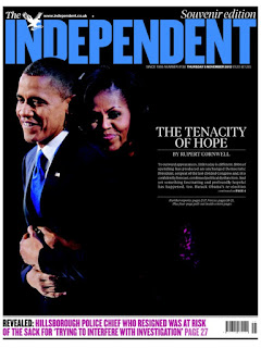
The Independent chooses a tender picture of Obama and Michelle and lets it take over almost the entire page, using the residual black to excellent effect. 'The tenacity of hope' is a poignant label that made me want to read the story (the sole purpose of a headline). It sits on top of a great read by Rupert Corwnall but a write-off rather than a turn line might have worked better. I turned straight to Page 4 to find out why something 'fascinating and profound' had happened ... and forgot to revisit Pages 2 and 3. I guess I wasn't alone. Not sure why the Hillsborough cross-ref needs to be in bright magenta but I love the titlepiece, lifted from the colour of the tie.

The Times was bound to do a wrap ... and here it is. There are a lot more words than its usual approach - a front page comment - and the back is just ticker-tape. Having committed to a wrap it couldn't really use the family picture as it would have split them in half. The gatefold graphic on the inside of the wrap was simply wonderful. If you haven't seen it, get a back copy.

The Guardian offers a lesson in effective layout. It chooses the right picture, crops it as tight as it will go and uses it across the full width at the top of the page. The strongest quote is the headline but it sits underneath, where it doesn't interfere with the picture. There are plenty of words but thoughtful typography and white space make it very readable. Simple.

Finally, elsewhere in the world The Daily Star in Lebanon caught the eye. It went to press before the result was known so it created a mirror front page. The reader could then simply flip it once the result was known.

Clever. Although maybe the Star meant something else altogether - such as whoever won it wasn't really going to make a great deal of difference.
Front pages courtesy of www.newseum.org/ and @suttonnick #tomorrowspaperstoday
No comments:
Post a Comment