Wednesday, 31 July 2013

Desolation row is gold for North's newspapers


There's nothing quite like a misinformed Southerner slagging off the North-East to get the region galvanised. And if that person is a Tory toff all the better. When I was at The Northern Echo we had all kinds of slurs directed our way. There was the Tory minister who said 'the problem with the North-East is that there are not enough golf courses.' Cue outrage. And when there was a proposal to relocate MoD jobs from London to Teesside, business editor Terry Murden went South to discuss perceptions of the North. Everything he needed to know was found on a map of Britain hanging on an MoD wall. Someone had drawn a line across the country, just north of Birmingham, and above it sketched smoking factories and written the word 'permafrost'. Did we have fun with that one. Now Lord Howell of Guildford has added his name to the notorious list. During Lords questions he dropped in the remark that 'there are large and uninhabited and desolate areas, certainly in part of the North-East where there's plenty of room for fracking.' Cue even more outrage. What makes it all the more perfect is Lord Howell's credentials. He is Margaret Thatcher's old energy minister, George Osborne's dad-in-law and you don't get any more southern than Guildford.
This great stuff for North-East loyalty … and the newspapers did themselves proud. 
The Northern Echo carried this front page which appeared on national TV and has been retweeted hundreds of times.

Editor Peter Barron also covered the issue in a robust blog and has now encouraged readers to send in their photographs to show how 'fracking beautiful' the North-East is.


The Journal also carried a cracking fracking front page. Lord Howell has apologised - but it's all too late. The newspapers are not going to give up on this one. It's all just what is needed in the height of the silly season - a silly Tory peer with foot in mouth disease. This one will fill page after page, get the readers involved and run for weeks. Newspaper gold.

Illustration: Huffington Post

Headlines from the musicals


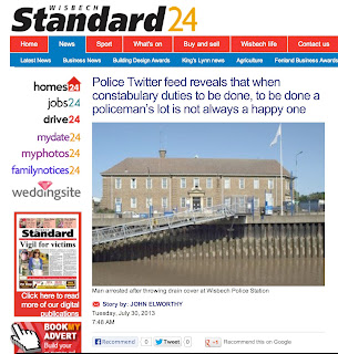
The Wisbech Standard is definitely living up to its front page promise to teach the world to sing. Since the splash earlier in the month it has gone on a roll with old musical headlines. 


Following the tribute to Tommy Steele it has now turned its attention to Gilbert and Sullivan. Last week Flash Bang Wallop from Half a Sixpence ... this week A Policeman's Lot from The Pirates of Penzance. 


Barely had I tweeted this and along came another - this time a Queen tribute. I suspect we haven't seen the last of these. What next I wonder?  

Tuesday, 30 July 2013

Why paper will always be around ...


If you ever needed definitive proof that paper is not dead ... here it is. Thanks to @george_dearsley for making me smile with this one.

Sun gives Pope the Manilow treatment


Following last week's Tommy Steele headline in the Wisbech Standard, it's the The Sun's turn to put an old singer into the limelight. It uses a Barry Manilow headline and strapline over an astonishing picture of crowds on Rio's Copacabana beach. So blindingly obvious now you see it ... but brilliant nonetheless.  

Wednesday, 24 July 2013

We need more Tommy-Steele inspired headlines


Headlines based on song titles are a valid weapon in the headline writer's armoury - but I have never seen one like this before. 'Flash bang wallop' has been used many a time - but the whole lyric, right down to the 'um-tiddily-um pum' and the 'stick it in your family album' is a new one on me. It just doesn't really have anything to do with the picture. Still, as @christofflennon who drew it to my attention says, we don't really get enough Tommy-Steele inspired headlines in newspapers these days. So, if anyone has any more Tommy Steele headlines, I would love to hear from you. Previously mentioned song titles headlines can be found here, here and here. 

Tuesday, 23 July 2013

Nice one, Son ...

Here's the challenge. There are no pictures of the baby, no name, nothing that hasn't been online and not even a picture of the beaming dad leaving the hospital. So how were newsrooms going to pick the bones out of that one?


Well, full marks to The Sun ... a flash of brilliance. The po-faced Twitterati didn't all like it but credit where credit is due. And it's arguably more interesting than the event itself. Heirs to the throne come along every so often ... but when was the last time a newspaper changed its name into a headline? 


The Times goes for one of its trademark wraps - a striking picture of Kate is self contained on Page 1. Bizarrely it doesn't mention anywhere on the front or the back that it's a boy (I guess everyone knows already). It does look like it could have all been done in advance so everyone could go home. Powerful coverage though.


The Media Blog put together this neat spoof for The Times instead, reflecting the mood of the hacks outside the hospital ... and possibly the nation. It even mentions that it's a boy.


The Daily Mail took the focus off the couple and on to the grandad. Charles was out and about in York so live pictures were available. A nice bit of sideways thinking. Plenty of knockers for this angle too - but, come on, it's a live picture (and a good one too). An original front.


The Independent also deals with the story in its time-honoured way - by not leading on it.


My friends at The Irish News in Belfast can go one better than that though. Sticking to its Nationalist roots, the paper doesn't mention the Royal Baby at all on Page 1. A newspaper that knows its audience.


The Guardian, perhaps surprisingly, does lead on the story and manages to conjure up a lot of front page words.  It uses the easel picture and a headline that tries hard to be profound.


And here's another question. When was the last time The Daily Telegraph had the same splash headline as City AM, the Star, the Express and The Irish Sun?  My Twitterfeed was strangled by the words It's a boy yesterday, so we might have expected something that takes the story forward a little. And a hat-tip to @helenlewis who tweeted to point out that a Royal Baby pullout wasn't the happiest of phrases ... sounds like a forceps delivery, she said. I would have thought hanging on until the pictures of the baby were available would be the time to run the souvenir pullout. Can there really be enough new material to warrant a supplement?


The Mirror also carries a pullout, a file picture and an Our Little Prince headline. 


All very nicely executed ... but I was hoping it might have had a bit of fun with its front page from March.


In the regions, I like The Sentinel in Stoke - going for a blue for a boy makeover, right down to the choice of picture, and a nice headline on the fact that Potteries firms will make millions from the birth.


The Northern Echo also went for It's a boy - but the King Edwards tag on the fish and chips blurb is a nice touch.


Meanwhile Private Eye simply tells it as it is. 


Thanks as always to @hendopolis and #TomorrowsPapersToday

Saturday, 20 July 2013

Holiday reading list for journalists


The silly season is upon us ... when depleted newsrooms become even more depleted as weary hacks jet off to sip cocktails and expose their pallid skin to a quick burst of sunlight. But if you are one of those lucky journalists packing your holiday bag there is one thing you must do before you go - consult my poolside reading list. With the help of colleagues, I have updated the list of novels worth reading that are all based in newspaper offices or feature a reporter as one of the main characters. There are now around 40 books, from 1850 to modern day. The list is here. There are plenty of great reads that are guaranteed to remind you of the cut and thrust of the newsroom while you lie on the beach ... and make you appreciate your break even more.  


Monday, 15 July 2013

Tony Metcalf - a great newsroom character


I am deeply saddened to hear of the death of my former Northern Echo colleague Tony Metcalf. When I was editor, Tony had not long arrived from the Scarborough Evening News. He was a tall, amiable Geordie who supported Newcastle United. He was also a naturally gifted reporter who quickly rose through the ranks. He became assistant news-editor and regularly demonstrated his natural eye for a story. His news-lists were always dominated by hard news. He was a really good footballer too - an asset to the Echo's formidable team. I moved south and Tony's career progressed, becoming news-editor and then assistant editor before spending time heading up the journalism course at Darlington college. The last time I saw him was 16 years ago, when he came on an editor's chair course in Hastings. He was still the same ... ambitious, enthusiastic and great company. The last time we were in touch was in 2010 when another of our Echo colleagues, Patrick Lavelle,  prematurely died. 
By then Tony was in New York, working as editor-in-chief for Metro US. He was taken into hospital this March for a routine bowel operation but was diagnosed with terminal cancer. He died in Darlington yesterday morning. He was 50. There is a fitting tribute to him by Nigel Burton in The Northern Echo today. It includes a quote from editor Peter Barron: “Tony was not only a fine, passionate journalist but a great character to have around. He brought infectious energy and fun to the newsroom, led from the front, and The Northern Echo was lucky to be one of the newspapers which benefited from his great qualities. He will be greatly missed.” Says it all.  

Saturday, 13 July 2013

Has digital changed the art of headline writing?


Here is my latest article for InPublishing magazine - looking at the differences between writing headlines for print and online. There is some good insight by those who know, including Mail Online deputy publisher Pete Picton, Guardian backbencher Simon Ricketts, The Sun's Victoria Watson, the Indie's Martin King and media consultant Andy Drinkwater. If you have great eyesight you can read the print version by clicking on the images above or, if you prefer, you can read it online here. The headlines are the same in both versions. If you missed my last InPublishing article, on humour in newspapers, it's here

Sunday, 7 July 2013

Murray: some mint front pages

It's been 36 years since we have had a British singles Wimbledon champion ... and 77 years since the title has gone to a man. So there's certainly been plenty of time for the newspapers to plan their front pages. This is how they played it  ...

There is one picture that just had to dominate. A Brit kissing the trophy after all these years. Most newspapers chose to go for that ... but not The Times.


After the success of its Olympic wraps last year, it clearly wanted to find a horizontal picture that could tell the story. At first glance it appears an odd choice, a Where's Wally concept. It sums up the moment though ... the Wimbledon crowd finally being able to pour adulation on to a British male champion. The headline, The History Boy, is understated and incidental. A classy cover. There is a fascinating piece on how the picture was chosen and the other visuals that were rejected by Times designer Jon Hill here.


One of the most radical pages is by the Eastern Daily Press. Instead of a conventional wrap it chooses to go sideways, effectively creating a broadsheet page. It is certainly bold, eye-catching and captures the euphoria, not just of Murray but of the Lions and local events. A real feelgood page. Normally a wrap works hard at keeping the front self-contained but editor Nigel Pickover hasn't let that constrain him. He says: "I see too many papers looking the same each day - and often that is dull. With sport at the centre of a super weekend it was clear that we could do a wrap taking in the back page as well as the front. But with so many elements - Andy Murray, Lions, Lord Mayor's Parade, sunshine weekend, big boost to local economy, I wanted a storyboard with x-refs rather than a predictable write-off. Whatever the reaction, it was different - and the public likes to pick up something new." 
Boring is the biggest sin in newspapers these days - and nobody could accuse the EDP of being that.


The Courier in Dundee also uses a wrap ... and a really tight crop on the 'kissing the trophy' picture. The front page is definitely self-sufficient here ... and no headline is needed. A fantastic use of the picture and a really confident piece of work.  


The Daily Mail, without doubt a tennis paper through and through, inevitably goes big on the 'kiss' photo. It's another good crop - neatly tilted - and nice repro too (at least on the PDF). For the headline, the Mail abandons the usual serif caps for a small lower case sans. It's slightly awkward phrasing though - I am not sure I have ever seen 'it'll' on a splash headline before. Nevertheless, a front page with impact.


The Sun has dug deep for this pun. 'And' for Andy might stretch it a bit ... but it's a powerful tabloid effort that endeavours to capture the mood. The strapline puts it all in context.


The Guardian appreciates the value of the 'kiss' picture too - and with the Berliner size can go big. The crop is looser than the Courier and even the Mail, leaving in the arms and more of Murray's head. The paper takes the view the word Champion placed unobtrusively down page will suffice. A paper that's raison d'etre is comment and analysis - with only one word on the front. It works though.


A similar picture - but a much looser crop - and one-word headline grace The Scotsman's front. 


And the 'kiss' picture also finds its way on to the Express front ... a nice tight crop, but not quite as bold as some of the others. The headline is just a simple bit of alliteration which probably wasn't 77 years in the making. Favourite Express characters Abu Qatada and Nigella Lawson push the tennis down the page a little.


The Daily Telegraph opts for a different image - a frontal view which captures Murray's elation and a rare beaming smile. A caps headline on the front of the Telegraph is rare too. The Telegraph is the only paper that puts any meaningful amount of text on Page 1. 


The Daily Mirror chooses a similar image to the Telegraph but with a tighter crop and a neat cutout. History in his hands works nicely with the picture.


The Independent plays it straight with a classic Wimbledon pose and the same one-word headline as The Guardian and The Scotsman. Detailed cutout of the trophy.


The 'kiss' picture pops up on my old paper, The Northern Echo, too with a crop almost as tight as the Mail's. Nice headline. This cover will have been a labour of love for editor Peter Barron, a big tennis fan and mean player.
   

The Daily Star clearly felt it ought to lead on Murray ... with a pun on his inevitable knighthood. Not a bad tabloid play on words and one that will hit a note with its readers. 'Andy on the lash' really means 'He's one of us at heart'. There is no way Murray was ever going to be the main picture though ... not with so much summer celebrity flesh on show. 


Unless, that is, you live in Murray's native Scotland where there is a far more wholesome Daily Star available.

It was great British sporting moment, with some memorable front pages to celebrate it. Collector's items ... and a good an excuse as any to go out and buy a selection. 

Thanks as ever to the excellent , @suttonnick 

How newspapers can score with kids football


This magazine is my labour of love. Twenty years ago when I shipped up in East Sussex from the North of England I had two sons aged five and six. They were keen footballers, as was I, but the local villages had no junior football club. So, along with another dad, I set one up. Beckley Rangers FC started in 1995. I was secretary from the beginning, until I stood down last year. I coached one of my son's teams through to under 18s and then started again with my youngest. Each year since 1997 I have produced a magazine for the club. This year it is 16 pages and there are 140 copies, one for each player and coach. It contains a pen-portait and picture of every player and full stats. Today, at our end of season awards, each boy or girl will be presented with an engraved trophy and the magazine. It has always struck me that this is what community publishing is really about. Junior sport has the potential to be a huge opportunity for local newspapers. Our club serves just four villages and has around 100 young players. Multiply that by all the villages in the area and there is a large, captive audience ... youngsters who relish seeing their names, pictures and achievements in print. They can get the results and write-ups online through the league websites - but they want something more tangible to keep and to send to granny. So why haven't local newspapers fully got to grips with this? The clubs are run by enthusiasts who are more than happy to supply write-ups, pictures and stats ... they just needed to be told. A few newspapers do it well, more pay lip service and others don't bother at all. When I go to summer tournaments, where there are hundreds and hundreds of youngsters with their families, I have yet to see a reporter, photographer or even a newspaper bill. This, surely, is the essence of local coverage ... and far more compelling than some of the content I see in many a newspaper. 

Thursday, 4 July 2013

A July 4 front page to celebrate


As someone who has always banged on that the front page needs to be eye-catching and different, I was really pleased to find this celebration of July 4 from the Virginian Pilot. Fantastic execution ... and first rate typography too. There's a typically great analysis of how it came about by Charles Apple here.

Lincolnshire Echo's murder wrap


Here's a cracking idea from the Lincolnshire Echo which is bound to win friends with its growing Eastern European community. Today the Echo has published a four-page wrap around the main paper ... and set it in Russian, Polish, Latvian and Lithuanian. More than 800 copies are being given away in the city. The bold innovation follows the murder of Latvian Vasilijs Ransevs who was found dead in his city centre flat on Sunday June 16. A post-mortem revealed he had died of head injuries. 


The wrap also carries information about the local community police officers who have the difficult job of engaging with the Eastern European community. Reaction this morning has been excellent with people saying they can speak and understand English ... but not always read it. 
Echo Editor Steven Fletcher (@stevenfletcher1) says: “I just thought we needed to do something different. The Echo has trust and loyalty within the community, and this is a way of getting the message across to thousands of potential witnesses in a different way.
“By giving it away for free, we can put the special edition in outlets which wouldn’t usually stock the Echo, and so get the witness appeal across to as many people as possible. Production costs have been covered by the police, so we are in a win-win situation.”


Publishing wraps is not something new at the Echo. An eye-catching and bold campaign to save Lincolnshire Prison carried a paid-for wrap by a law firm in support ... and helped the paper win Midlands Newspaper of the Year last month. 


And in the last six weeks the Echo has run other paid-for wraps including this one for a steakhouse. Definitely some creative thinking going on in Lincoln.