There were a couple of design innovations that caught my eye last week. The Sun’s unusual sideways headline on Page 1 on Thursday generated a flurry of interest on Twitter. Lots of people seemed to like it. Neil Bonnar, head of sport at the Bolton News, said: "Sun have done it again for me. Genius attention grabber”. Emma Bryant, editor of the Carmarthen Journal and a first-rate production journalist, applauded The Sun for trying something new and even Trinity Mirror’s regional editorial director, Neil Benson, said he couldn’t make his mind up whether he liked it or not. "Suppose the alternative was 15 decks x 3 characters,” he said. My view? It was innovative as a one off perhaps but let’s hope it doesn’t lead to a flurry of copycat pages with tilted headlines, upside down pictures and topsy-turvy text. The danger in design is that we introduce fads and gimmicks because we can - rather than remembering how people read. I remember the change from hot metal to paste-up that led to an epidemic of WOB arrows, starbursts, rounded corners, circular pictures, text overlays and winged-in rules. We were free from the constraints of the linotype machine so we threw every design trick in the book at the pages. It settled down of course and most (one or two advertising departments excepted) went back to thinking about the poor reader. Turning the page sideways, other than for the crossword puzzle answers, isn’t really reader friendly.
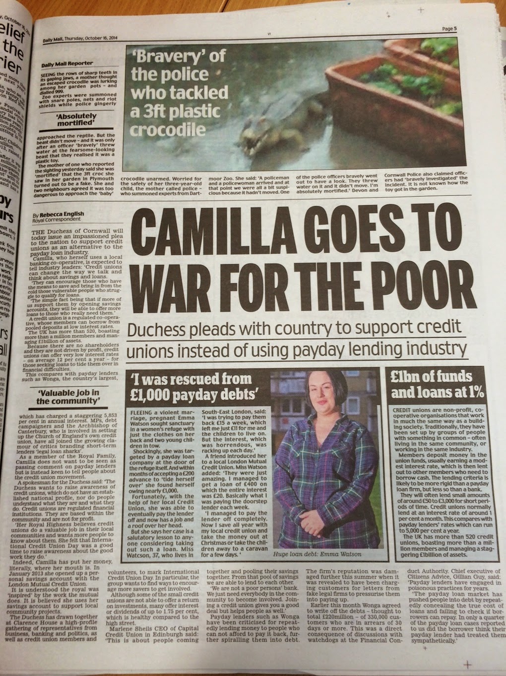
On the same day, I was equally surprised to see this page in the Daily Mail. Normally the Mail’s news pages uses lower case serif headlines but here, straight out of the Daily Mirror, was Interstate caps. Initially I though there had been a plate mix-up on a press somewhere … but, no, it is a Mail page. A mistake, an experiment or the sign of things to come?
|
A Mirror headline using Interstate caps
 |
| The usual Mail news page typography |


LIve typeface testing's an interesting move. When I was at ncjMedia we bought in Interstate as part of a partnership with NewcastleGateshead Initiative for some work we were doing around the Tall Ships Races. Later, because it was on the system, it ended up in an in-house redesign of the (then) Evening Chronicle. I never saw it ending up in the Daily Mail.
ReplyDelete